
Background
Overview: When Compass Group merged Parker Young Construction and McCabe Construction into a new restoration platform, a logo had already been created by our team been and well received. However, Compass Group wanted to explore an alternative creative direction — something that offered a fresh lens and expanded the visual possibilities of the new brand.
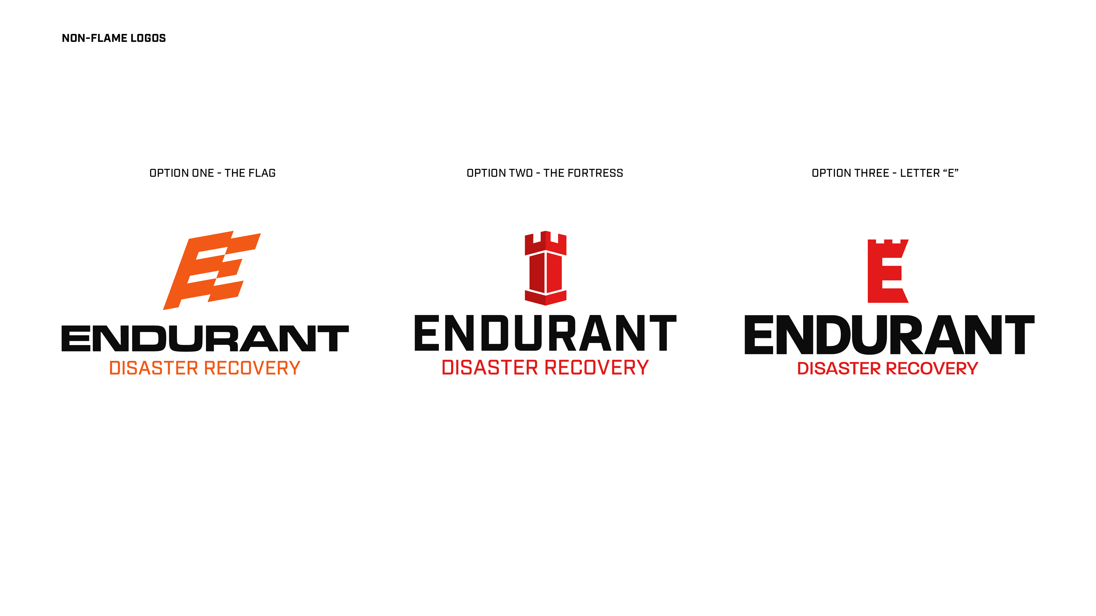
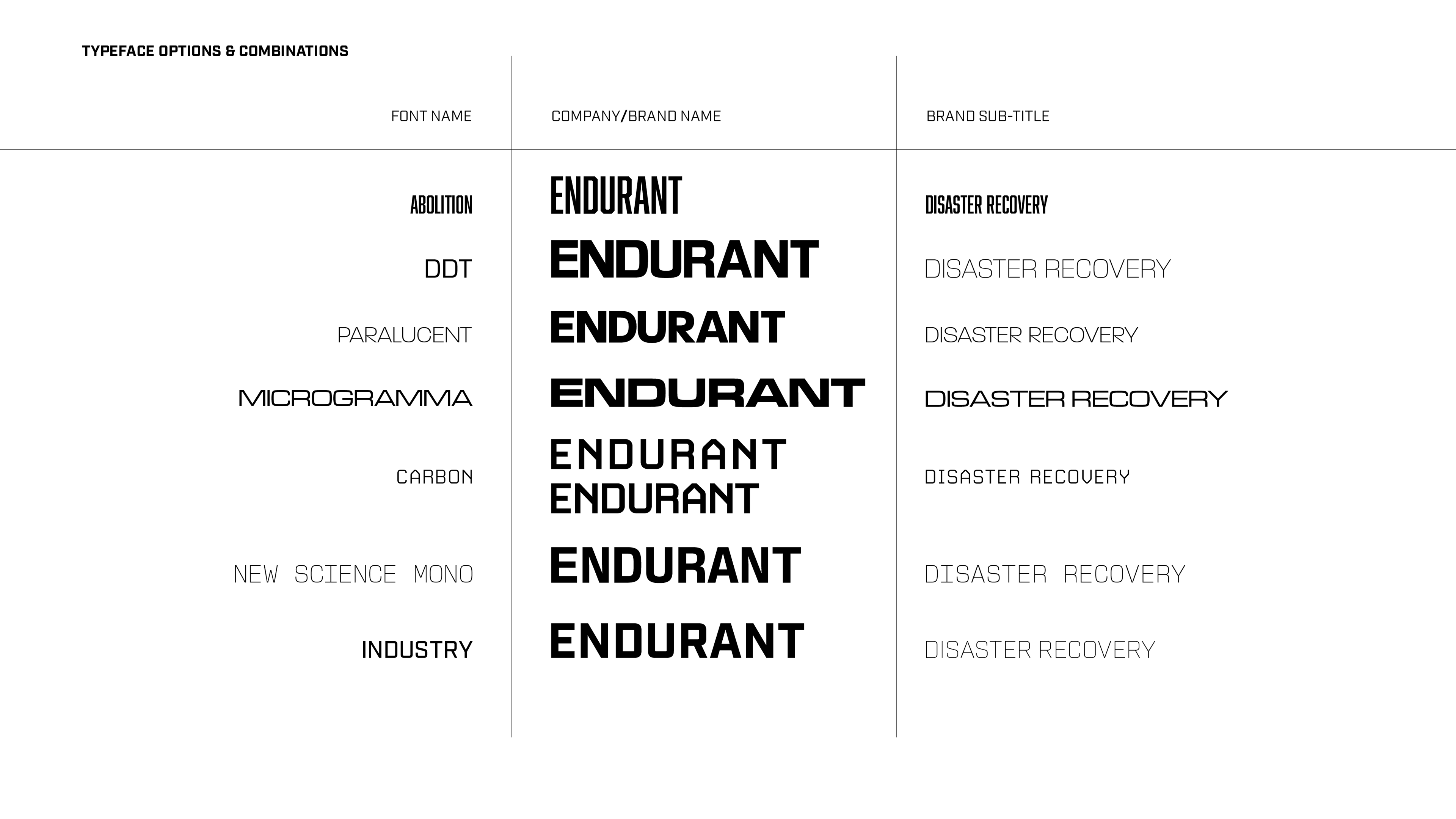
My task: Develop a completely different logo direction — one that captures the essence of restoration and unity without using flame or fire elements featured in the existing concept.

CONCEPT ONE - THE FLAG
In this concept, the “E” is reimagined as a flag, waving proudly in stiff winds. Its upward slant evokes resilience, strength, and forward momentum, serving as a visual metaphor for Endurant’s defiant stance in the face of adversity. More than just a symbol, the flag becomes a beacon of assurance, embodying a brand that is strong, proud, and unwavering when it matters most. This idea draws inspiration from both America’s national anthem, The Star-Spangled Banner, and the study of flags, known as vexillology.
The guiding line, “Gave proof through the night that our flag was still there,” reflects Endurant’s enduring presence through hardship. In researching historical flag forms, I found two that perfectly aligned with this vision — the swallow-tail with tongue and the streamer — whose bold, angular shapes provided the ideal foundation for transforming the letter “E” into a modern emblem of strength, pride, and perseverance.


CONCEPT TWO - THE FORTRESS
This design draws inspiration from the stout fortifications that line the Southeastern seaboard — structures built to withstand time and turmoil. At its center is a towering turret, symbolizing Endurant’s unshakeable commitment to protecting its clients’ interests. The form serves as a visual shorthand for a brand that is fortified, lasting, and unyielding — one that embodies stability and strength, and stands firm when it matters most. The letter "E" can also be found at the top of the fortress.


CONCEPT THREE - THE LETTER "E"
This concept features a bold, stylized crown atop the letter “E”, symbolizing strength, reliability, and resilience in the face of adversity. The crown serves as a visual metaphor for leadership — reinforcing Endurant’s position as a commanding, reliable, and steadfast force in the restoration industry. Designed to instill confidence and trust, the mark signals to customers that Endurant isn’t just present during a crisis — it leads with authority, capability, and unwavering support when it matters most.


CONCLUSION
While the final brand direction retained the torch theme—a visual element Compass Group had used historically—this alternative exploration offered a bold departure. My concepts provided the team with fresh creative perspective, showcasing how the brand could communicate strength, unity, and resilience without relying on flame symbolism. Though not selected, the work I created played a key role in expanding the visual conversation around the new identity.